
Custom CSS is an advanced feature that gives you finer control over the look and feel of your blog. You can change fonts, colours, adjust spacing, hide elements and more.
New to Custom CSS? Try the Theme Garden first – it has curated CSS templates you can preview and apply with one click, no coding required.
A Quick Note
Pagecord is a small business. It's not possible to offer customer support with writing or debugging custom CSS – you're on your own with this one!
If you're new to CSS, check out the MDN CSS First Steps guide.
Blog Structure
To help you know which elements to target, here is a visual map of the blog page structure:
┌──────────────────────────────────────────────────────────┐
│ body (Main background and global font)                   │
│ ┌──────────────────────────────────────────────────────┐ │
│ │ .blog                                                │ │
│ │ ┌──────────────────────────────────────────────────┐ │ │
│ │ │ <header>                                         │ │ │
│ │ │ ┌──────────────────────────────────────────────┐ │ │ │
│ │ │ │ <nav> (Links and social icons)               │ │ │ │
│ │ │ └──────────────────────────────────────────────┘ │ │ │
│ │ │ ┌──────────────────────────────────────────────┐ │ │ │
│ │ │ │ .titlebar                                    │ │ │ │
│ │ │ │ ┌──────────────────────────────────────────┐ │ │ │ │
│ │ │ │ │ .avatar-container (when avatar present)  │ │ │ │ │
│ │ │ │ │ [ .avatar ] [ .blog-title ]              │ │ │ │ │
│ │ │ │ └──────────────────────────────────────────┘ │ │ │ │
│ │ │ └──────────────────────────────────────────────┘ │ │ │
│ │ │ ┌──────────────────────────────────────────────┐ │ │ │
│ │ │ │ .bio (Your profile description)              │ │ │ │
│ │ │ └──────────────────────────────────────────────┘ │ │ │
│ │ │ ─────────────────── <hr> ──────────────────────  │ │ │
│ │ └──────────────────────────────────────────────────┘ │ │
│ │                                                      │ │
│ │ ┌──────────────────────────────────────────────────┐ │ │
│ │ │ <article class="post">                           │ │ │
│ │ │ ┌──────────────────────────────────────────────┐ │ │ │
│ │ │ │ .post-title                                  │ │ │ │
│ │ │ └──────────────────────────────────────────────┘ │ │ │
│ │ │ ┌──────────────────────────────────────────────┐ │ │ │
│ │ │ │ .post-body (The post body text)              │ │ │ │
│ │ │ └──────────────────────────────────────────────┘ │ │ │
│ │ │ ┌──────────────────────────────────────────────┐ │ │ │
│ │ │ │ <footer> (Date, tags, and actions)           │ │ │ │
│ │ │ └──────────────────────────────────────────────┘ │ │ │
│ │ └──────────────────────────────────────────────────┘ │ │
│ │                                                      │ │
│ │ ┌──────────────────────────────────────────────────┐ │ │
│ │ │ .blog-footer (Pagecord branding)                 │ │ │
│ │ └──────────────────────────────────────────────────┘ │ │
│ └──────────────────────────────────────────────────────┘ │
└──────────────────────────────────────────────────────────┘
Where to add the custom CSS
Head to Settings > Appearance and scroll to the "Custom CSS" section. Paste your CSS code into the text area provided and click Save Custom CSS.
Custom CSS is available to customers with premium access. Your CSS is inserted into the <head> of your blog pages and is only rendered while your account has premium access.
For safety, Pagecord validates custom CSS before saving it:
- The maximum size is 16KB
-
@importis only allowed for HTTPS URLs from Google Fonts and Bunny Fonts - CSS custom properties, logical properties,
@supports, and@layerare supported - Unsafe content, invalid import URLs, and unsupported syntax such as nested CSS are rejected
Examples
Here are some examples of CSS snippets you can use to customise your blog.
Changing the font
Pagecord has three lovely default fonts: Sans-Serif (Inter), Serif (Lora), and Monospace (IBM Plex Mono). If you'd like to use a different font, you can import it from Google Fonts or Bunny Fonts (the only providers supported). Here's an example of using the "Lato" font from Google Fonts which is a solid alternative sans-serif choice:
@import url("https://fonts.googleapis.com/css2?family=Lato:ital,wght@0,100;0,300;0,400;0,700;0,900;1,100;1,300;1,400;1,700;1,900&display=swap");

body {
  font-family: Lato, sans-serif;
}
Change the size of your blog text
Pagecord uses your browser's normal text size by default, which is usually 16px. If you'd like your whole blog to feel slightly larger, adjust Pagecord's base font size:
:root {
  --font-size-base: 112.5%;
}
That makes the default text size 18px for readers whose browser default is 16px, while still respecting readers who have changed their browser's text size.
If your text only feels a little small on mobile, you can make a smaller adjustment just for narrow screens:
@media (max-width: 640px) {
  :root {
    --font-size-base: 106.25%;
  }
}
If you only want to change posts and pages, you can target article:
article {
  font-size: 1.125em;
}
If you want to change only the authored post or page body, target .post-body instead:
.post-body {
  font-size: 1.125em;
}
Using a different font for headings
You might like sans-serif fonts for your body text and a serif font for headings. If your Pagecord font is set to Sans Serif, add this to switch headings to the default serif font:
h1, h2, h3, h4, h5 {
  font-family: "Lora Variable", serif;
}
Centering the Header
Center the navigation, title, avatar, and bio:
nav {
  justify-content: center;
}

.titlebar, .avatar-container {
  flex-direction: column;
  align-items: center;
}

.bio {
  text-align: center;
}
This targets both .titlebar and .avatar-container so it works whether or not you have an avatar.
Or pick and choose from the individual options below.
Centering the Top Navigation
By default, the navigation links are aligned to the right. This will move them to the center.
nav {
  justify-content: center;
}
Centering the Title and Avatar
If you have an avatar, target .avatar-container to stack and center both:
.avatar-container {
  flex-direction: column;
  align-items: center;
}
If you don't have an avatar (or want it to work either way), include .titlebar too:
.titlebar, .avatar-container {
  flex-direction: column;
  align-items: center;
}
Centering the Bio
Center the bio text below the title:
.bio {
  text-align: center;
}
Hiding the Avatar
If you have an avatar uploaded but want to hide it from your blog header (it will still be used for the favicon):
.avatar {
  display: none;
}
Make the title less prominent, and style it using all caps
.blog-title {
  font-weight: 200;
  text-transform: uppercase;
}
Change the border at the bottom of the header
By default the border is just a straight line. You can use CSS to create a more embellished divider. Here's an example that Olly uses on his blog:
header hr {
  border: none;
  text-align: center;
  background: linear-gradient(var(--color-border), var(--color-border)) center / 40% 1px no-repeat;
  margin: 2rem 0;
}

header hr::before {
  content: "☆";
  color: var(--color-text-muted);
  background: var(--color-bg);
  padding: 0 0.5em;
  font-size: 0.75em;
}
Reordering the header elements
By default, the navigation appears above the title. You can use CSS order to rearrange the header elements, for example to show the title first:
/* set the header to use flexbox layout and stack items vertically */
header {
  display: flex;
  flex-direction: column;
}

header > nav {
  order: 2;
}

header > .titlebar {
  order: 1;
}

header > .bio {
  order: 3;
}

header > .email-subscriber-form {
  order: 4;
}

header > hr {
  order: 5;
}
Add text to the reply by email button
You can add text next to the reply by email icon like this:
.reply-by-email::after {
  content: "Reply";
  margin-inline-start: 0.25em;
}
Or remove the icon entirely and just have text:
.reply-by-email::before {
  content: "Reply";
}

a.reply-by-email .icon {
  display: none;
}
Add text to the upvote button
You can add text next to the upvote icon like this:
.upvote::after {
  content: "Like";
  margin-inline-start: 0.25em;
}
Stack the post footer items on different lines
If you prefer the post footer items (date, tags, actions) to be stacked vertically instead of side-by-side, use this CSS:
article footer {
  flex-direction: column;
  align-items: flex-start;
  gap: 0.25rem;
}

article footer .post-actions {
  flex-direction: column;
  align-items: flex-start;
  gap: 0.25rem;
}
Styling posts by tag
Posts with tags include a data-tags attribute on their wrapper element. You can use this to style posts differently based on their tags:
[data-tags~="photo"] {
  border-left: 3px solid #f4a435;
}
Non-italic blockquotes
Blockquotes are styled in italics by default. If you prefer upright text, use this snippet. The second rule ensures that any emphasised text inside the quote still appears italic:
blockquote {
  font-style: normal;
}
blockquote em {
  font-style: italic;
}
Full-width images
By default, images display at their natural size. To make all images stretch to fill the full width of your posts:
article img {
  width: 100%;
  height: auto;
  max-block-size: none;
}
Left-align images
Images are centered by default. To left-align them instead:
article img {
  margin-inline-start: 0;
}
Galleries: fewer columns on mobile
By default, image galleries render in 2 or 3 columns depending on how many images you've added. On narrow screens this can feel cramped. Change the layout below a chosen breakpoint.
One image per row on mobile:
@media (max-width: 600px) {
  .attachment-gallery {
    grid-template-columns: 1fr;
  }
}
Two images per row on mobile:
@media (max-width: 600px) {
  .attachment-gallery {
    grid-template-columns: repeat(2, 1fr);
  }
}
Adjust 600px to your preferred breakpoint.
Posts gallery: customising the layout
The {{ posts | style: gallery }} dynamic variable renders posts as a grid of square thumbnails. You can target the following classes:
-
.posts-gallery– the grid container -
.posts-gallery-item– each tile (an<a>linking to the post) -
.posts-gallery-image– the wrapper around the thumbnail -
.posts-gallery-title– the post title (hidden by default)
Change the number of columns:
.posts-gallery { grid-template-columns: 1fr; }
@media (min-width: 600px) { .posts-gallery { grid-template-columns: repeat(2, 1fr); } }
@media (min-width: 900px) { .posts-gallery { grid-template-columns: repeat(4, 1fr); } }
Use the natural aspect ratio of each image (instead of square crops):
.posts-gallery-image { aspect-ratio: auto; }
.posts-gallery-image img { height: auto; }
Show the post title under each tile:
.posts-gallery-title {
  display: block;
  margin-top: 0.25rem;
  font-size: 0.875rem;
}
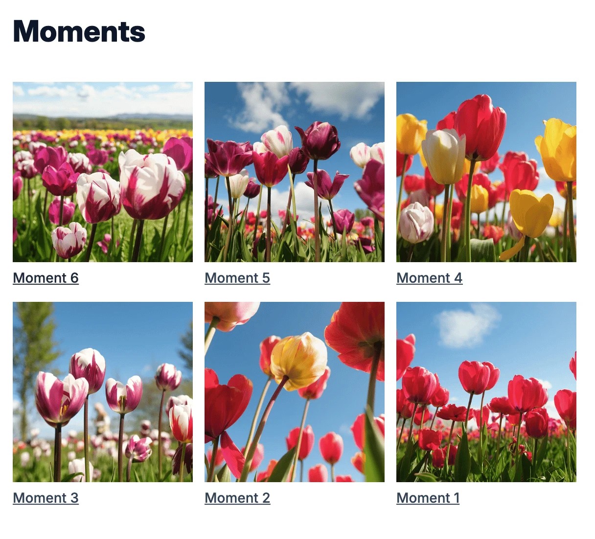
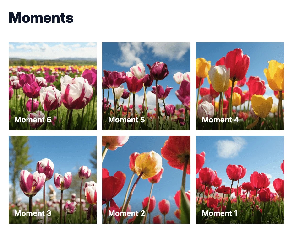
Show the post title inside the image:
.posts-gallery-item {
  position: relative;
  display: block;
}

.posts-gallery-title {
  position: absolute;
  inset-inline: 0;
  inset-block-end: 0;
  display: block;
  padding: 1.5rem 0.75rem 0.75rem;
  color: white;
  background: linear-gradient(to top, rgb(0 0 0 / 0.55), transparent);
}
This keeps the label background transparent at the top while adding contrast behind the text. If the title is still hard to read on pale images, add a subtle shadow:
.posts-gallery-title {
  text-shadow: 0 1px 3px rgb(0 0 0 / 0.7);
}
Adding a background image to your blog
You can set a background image so that it fits the viewport and scales nicely. It can be unreliable to rely on a 3rd party URL for the image, so I would recommend creating a page on your Pagecord blog and uploading your background image there. View the page, copy the image URL, then reference that image in your CSS.
body {
  background-image: url("https://images.unsplash.com/photo-1465146344425-f00d5f5c8f07?ixlib=rb-4.1.0&ixid=M3wxMjA3fDB8MHxwaG90by1wYWdlfHx8fGVufDB8fHx8fA%3D%3D&auto=format&fit=crop&q=80&w=2076");
  background-size: cover;
  background-position: center;
  background-repeat: no-repeat;
  background-attachment: fixed;
  min-height: 100vh;
}
To make the blog look nice with a background image, you'll need to add some padding and margin to the .blog container. I'd also recommend a border-radius too for curved corners, but that's optional:
.blog {
  margin: 2rem auto;
  padding: 1rem 2rem;
  border-radius: 1rem;
}
Another nice touch is to make the blog background slightly transparent to allow the background image to show through:
.blog {
  background-color: rgb(255 255 255 / 0.9);
}
Using opacity on .blog would also make your text and images transparent, so prefer setting a translucent background colour instead.